The Alpinist
Eaglevail

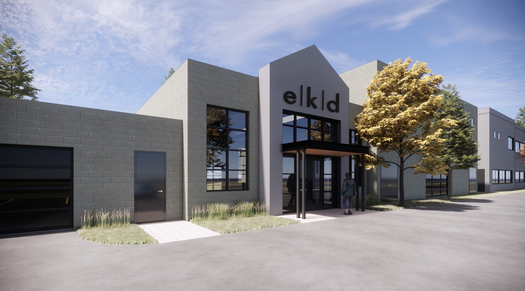
The Alpinist, a neighborhood workspace built for the hard-working people of the Vail Valley.
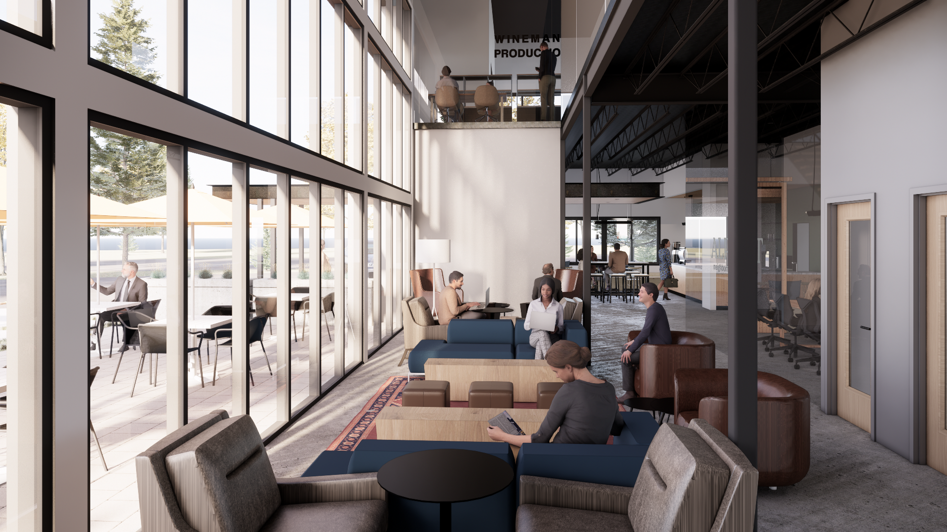
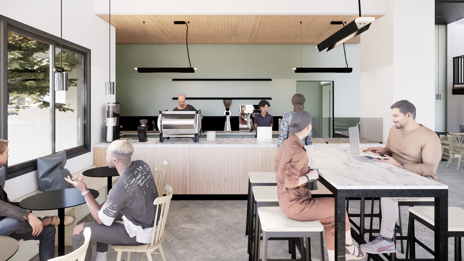
Our refreshed, reinvigorated, completely reimagined space is ready for you to redefine the future of work in the high country. Hang up your skis, bike, or golf clubs and settle into your own “outfitted-just-the-way-you” like it workspace surrounding a sun-filled, vibrant atrium and get down to business. When the work is done, well, we’re just off the I-70 on-ramp in EagleVail so you can get right back out there.
Creative Services
The Alpinist utilized full in-house design support from our creative team, here’s how the project and brand came together.
Brand System
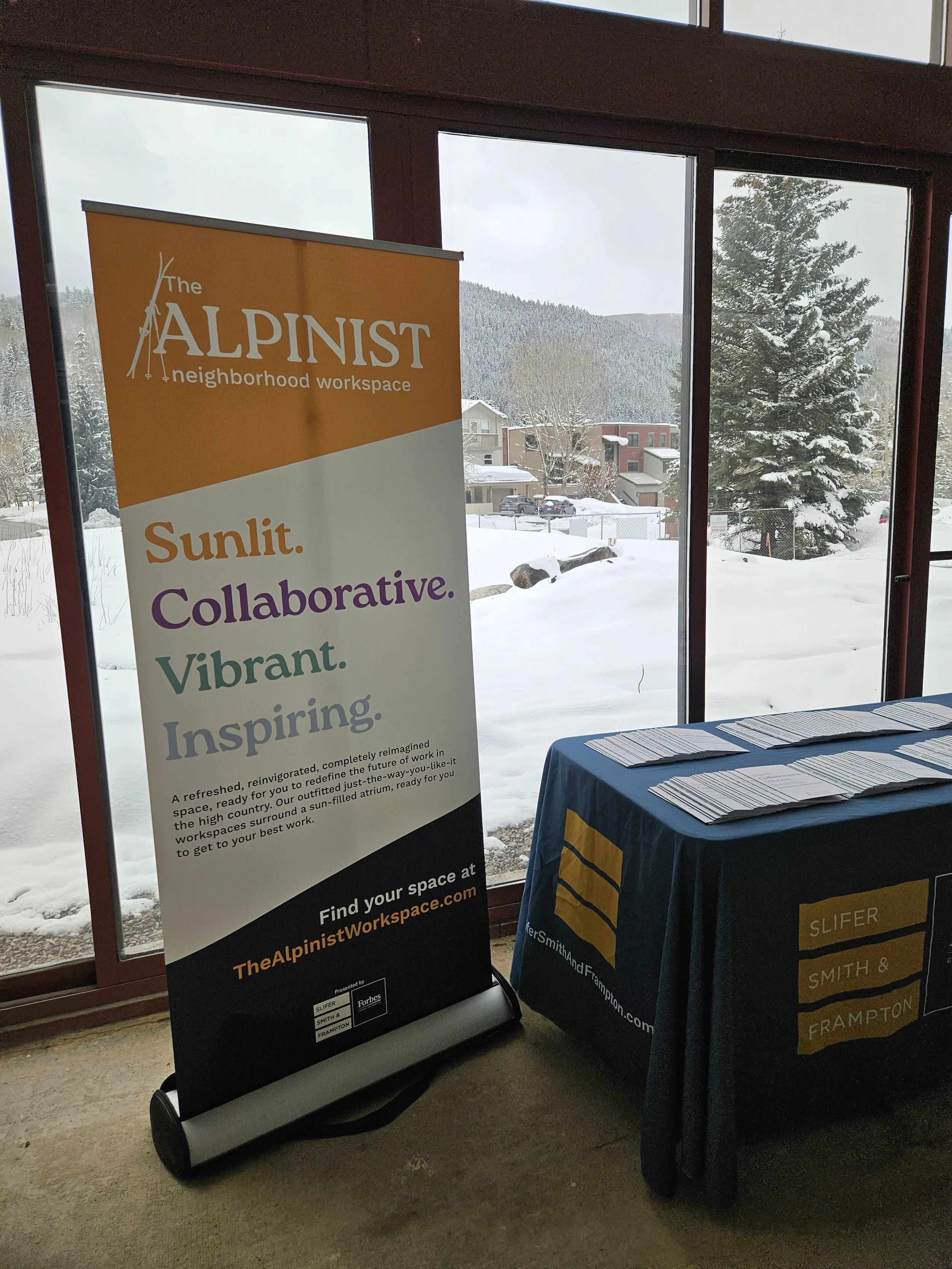
This project presented our team with a clean-slate, from the ground up branding opportunity for a project that aimed to become a true neighborhood focal point. We dove right in, starting with the name. We presented the team with a slew of options ranging from the solidly traditional (ex: Whiskey Creek Commons) to the much more modern (openspace). Ultimately we landed in a nice middle ground with a name that feels decidedly fresh and modern, while still nodding to our target markets and the aspirational nature of the project. The Alpinist. We finished the name with the modern and inviting suffix “neighborhood workspace” to open the invitation to check this place out to the whole community.
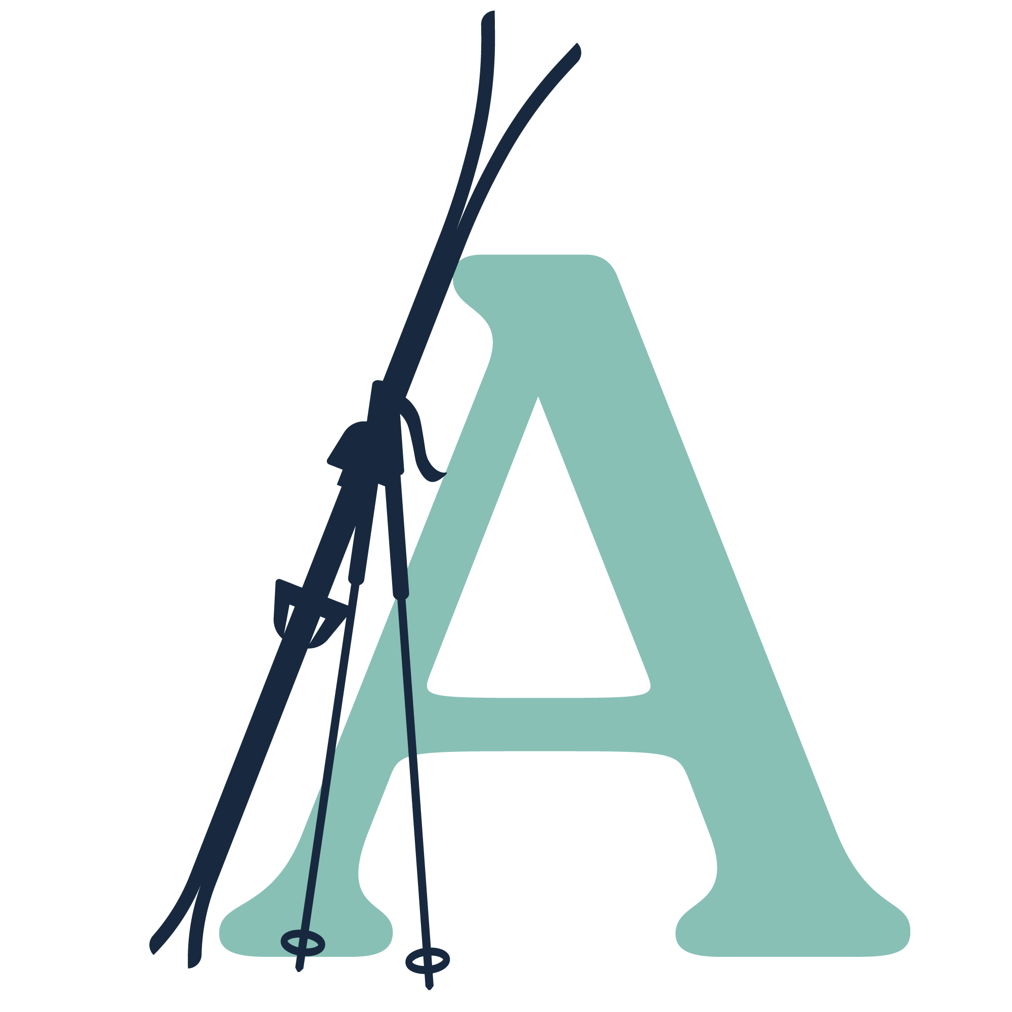
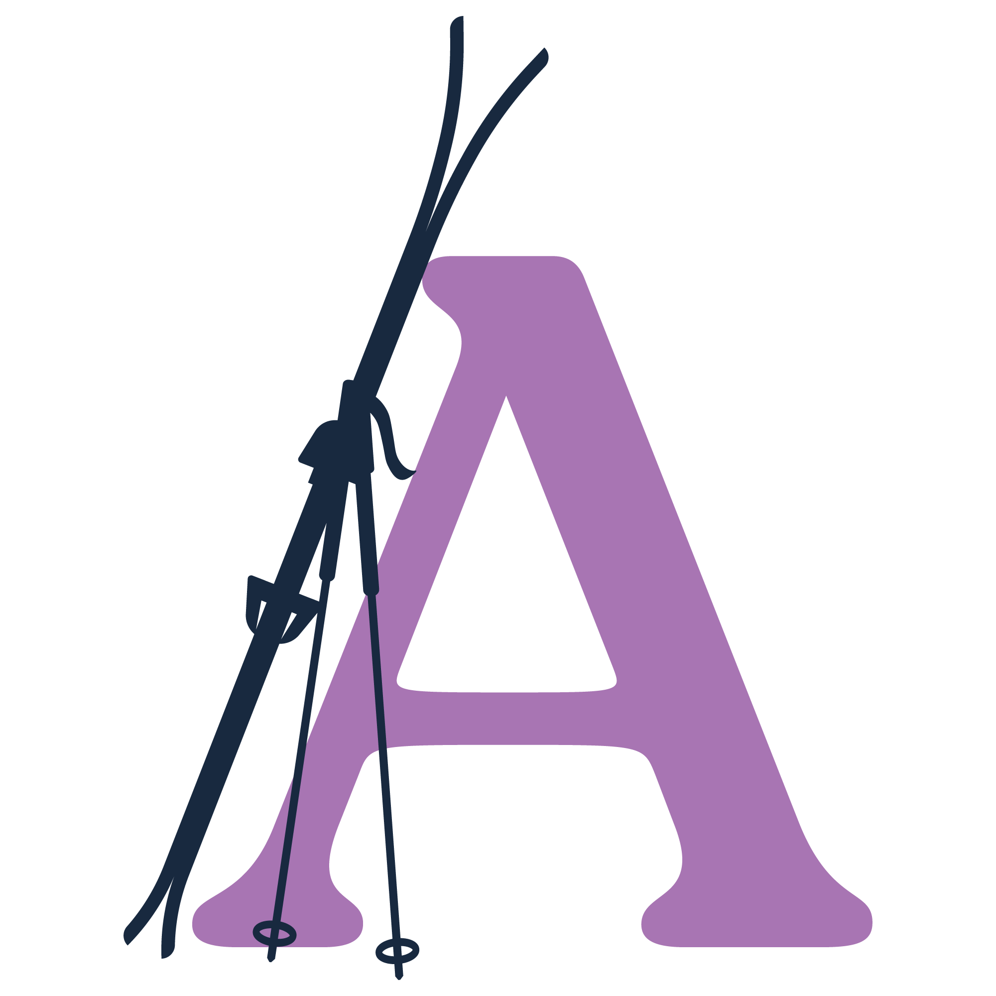
With a more modern name in hand we moved on to visual identity. Knowing that we wanted this to feel very fresh and modern, we aimed for adaptable and aspirational. The “A Skis” icon gave us an endlessly scalable and reusable icon that truly breathed life into the project. The icon also set a decisive vibe for this place, somewhere where you can come off the hill, hang up the skis and get to your best work. We topped it all off with a most adventurous color palette, a bold and fun tricolor sampled from the colors of vintage mountaineering gear.


Website
Next up, the website. Once again we kept things simple and brand-forward with a site integrated directly into our in-house design and CRM system at Slifer. We kept the layouts open and unconventional with a predominantly single-page scroll design that invites you to walk leisurely through the project. This was also the first appearance of much of the copy work we did for the project including the “Sunlit. Collaborative. Vibrant. Inspiring.” headline and “Let’s get to work.” CTA.

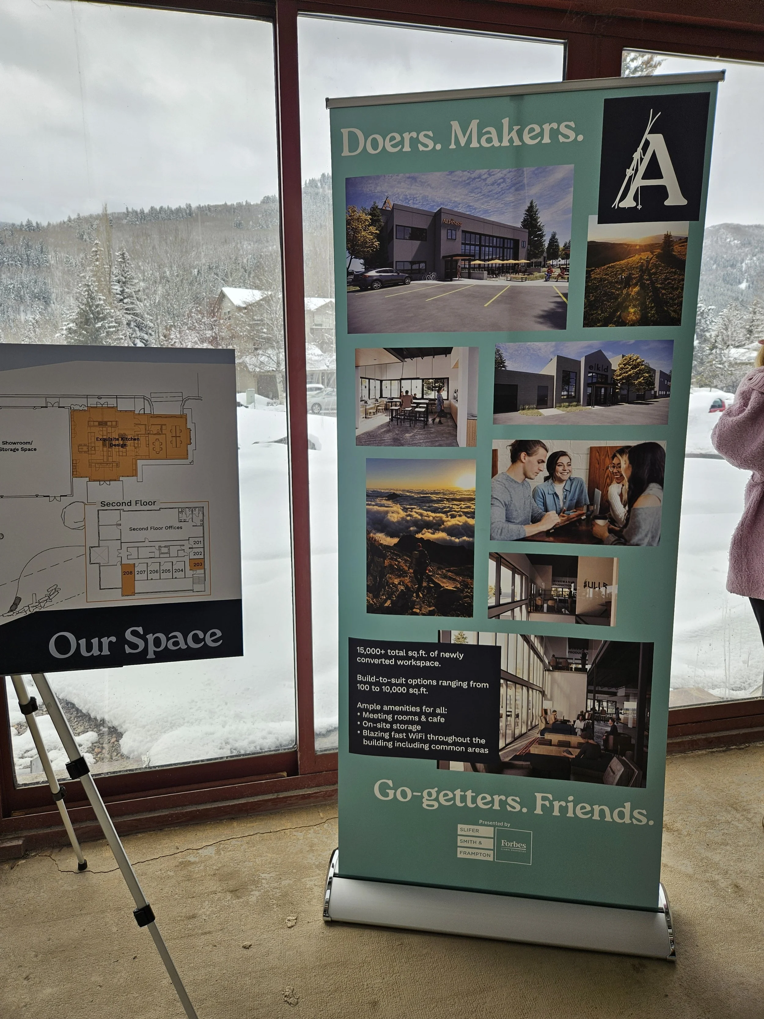
Sales & Event Materials
Last but certainly not least, we crafted a suite of sales and event materials for our broker team to use in representing the project. Copy and design cues were largely taken and held from the website design that had garnered such a positive reaction. But this suite of tools allowed us to represent the project in its very best light at all touch points, including a series of events that engaged the community and brought them in as this incredible space was brought to life.